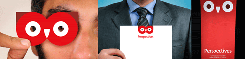
The Perspectives re-brand by RadonicRodgers Strategy+ has been awarded with four International Summit Awards including: Letterhead / Corporate ID (Gold), Consumer Logo (Silver), Display/POP/Exhibit (Bronze) and Logo Redesign (Bronze).
The re-branding project included updating the 28-year-old brand by retaining the strongest historical symbolic asset of the “owl” for the firm’s unique immersive language/educational/cultural tourism offering. The owl motif and the elementary brand construction elements, also form the natural iconography that were utilized on the Travel & Tourism firm’s stationery, POP displays, promotional items and Web site.
The bilingual French/English Perspectives Web site was also just recently re-developed and re-launched with all the new brand elements and a fully-featured booking engine for school/class/groups trips: www.perspectives-edu.com
See post about the re-brand and Web site Launched:
Launched > Perspectives looks up…